Sunday, November 4, 2012

30 in 30: Micrographica by Renee French


#2: MICROGRAPHICA
Storytellers: RENEE FRENCH
Publisher: TOP SHELF
Year Of Publication: 2007
Page Count (can be approximate or in # of issues format): 208 pages


WHAT I LEARNED ABOUT WRITING / STORYTELLING:
This is a story of naked mole rats going about their daily life – with this day revolving around a “crapball” one of them has discovered.  French injects them with very human characteristics through her dialogue, and in this way makes the story very relatable.  The emotional infusion she achieves through the very real conversations and arguments – and the distinct personalities and “little cruelties” that are exhibited in the narrative – had me engaged right from the start. 
 
WHAT I LEARNED ABOUT ART / STORYTELLING:
Since this is a collection of French’s online strip, within which she restricted the size of her drawings to only 1cm square (less than the size of a postage stamp), each page is only a single panel, which made it feel more like a comic strip rather than a traditional comic.  But even within these strictures, she managed to utilize the vocabulary of the comic panel to inject emotion within the narrative.  One instance of this is when two of the naked mole rats are arguing over who found the crapball – and, thus, who it belongs to – and French deftly conveys the anger of one mole rat by drawing an extreme close-up of its face (only one eye, the crown of its head and the upper bridge of its nose).  I felt that this worked extremely well, especially since almost all of the previous panels had shown the naked mole rats in full-body images.
 
RECOMMENDATION: B

Saturday, November 3, 2012

30 in 30 recommendation ratings

For anyone reading along this month, these are what the letter recommendations for each "30 in 30" book mean:

RECOMMENDATION: (see list below)

  • A (Must Read)
  • B (Entertaining, worth a read)
  • C (Runs the Bases, nothing more, nothing less)
  • D (Poorly Done, but there is learning here)
  • F (Poorly Done, Don't bother)

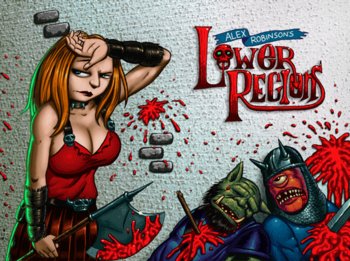
30 in 30: Alex Robinson's Lower Regions


#1: LOWER REGIONS
Storytellers: ALEX ROBINSON
Publisher: TOP SHELF
Year Of Publication: 2007
Page Count (can be approximate or in # of issues format): 54 pages


WHAT I LEARNED ABOUT WRITING / STORYTELLING:
This was a wordless comic.  I think because of this – and possibly due to the genre and the playfulness Robinson incorporated into this book – I was never able to connect with the characters.  It isn’t until halfway through the story that one is finally shown what the motivation for the protagonist is, and I think that hurts it. 
 
WHAT I LEARNED ABOUT ART / STORYTELLING: 
Because it was a wordless comic, Robinson was forced to rely entirely on the visuals to tell the story, and he managed that very well.  One panel, in particular, showcased how to lead the reader’s eye from one page to the next without sacrificing story-logic.  It is in the final panel of a left-facing page where the protagonist is thrown by a monster.  Robinson has the trajectory of this throw angled up toward the next page and accentuates this by drawing the panel with its top border angled up and to the right, as well, sending the reader’s eye up to the very next panel where the story continues.
 
RECOMMENDATION: B-/C+

NOTES / REVIEW / SYNOPSIS:  This read like a D&D adventure put into comic form, utilizing the tropes of the dark fantasy genre.  It was well done, in that regard, and there were some inventive storytelling moments, but overall, it felt “lightweight” and isn’t something I expect to re-read.  Considering it’s a wordless book, the $7 price tag could be off-putting, but if you can get it during the annual Top Shelf blowout sale, as I did, it’s worth it.

-chris

30 in 30 for November

Haven't posted here in months.  Mainly because I've been updating my thoughts and annotations on Alan Moore & Dave Gibbons's landmark book, Watchmen, daily over at Reading Watchmen. 

Anyway.  I'm a member of Andy Schmidt's Comics Experience online creators' workshop, which is a great resource for anyone who has a desire to learn about writing or drawing for comics.  For those unaware, Schmidt was an editor for Marvel (most significantly guiding the resurgence in its cosmic line with Annihilation and subsequent series) and a senior editor at IDW before recently moving to Hasbro.

This month, as a group, many of the members are attempting to read (and write about) 30 graphic novels or comic storylines in the 30 days of November.  Since the workshop is a place for creators to practice their creativity, we are approaching these comics with a focus on what lessons we can take away from them. 

With that in mind, I'll be posting my capsule reviews for those 30 books here, not only to get this blog up and running again but also to share my thoughts on some books you may not have read before. 

So, let the fun begin!

chris

Saturday, March 17, 2012

Why Before Watchmen is a bad idea

Besides the horrible title.

Over at Newsarama, Graeme McMillan wrote a blog post commenting that Before Watchmen may indeed be the project that rips the internet in half, as Brian Michael Bendis predicted "House of M" would.  McMillan points to the recent interview with Moore at Seraphemera and J. Michael Straczynski's interview at Aint' It Cool News. 

One point JMS, who is a creator I've admired for a long time (note: I haven't read any of his Spider-Man comics past those drawn by JRJr; I haven't read his recent Superman or Wonder Woman comics; and I've not read much, if any, of the work that has earned him such a bad reputation with fans and bloggers/critics), makes in his interview sits particularly poorly with me:

... neither Alan nor the detractors have the legal or the moral high ground here.
JMS argues a number of points leading up to this statement.  But, in signing on to this endeavor and in making the above statement, he - like a lot of other people - seems to completely miss the point at the heart of this argument.  Below is what I said in the comments section to McMillan's blog post:

I find it laughable and disappointing that JMS states Moore and his backers have no moral ground upon which to claim Watchmen 2 is a bad idea. I’ve been a fan of JMS ever since Babylon 5 ... but he, like so many others, seem to miss the point with this entire argument.

Neil Gaiman directly attributes his good working relationship vis-a-vis Sandman for DC/Vertigo with the way Alan Moore was treated and his vocal and strident response to that. Moore’s stance comes off as selfish to some, but at the heart of it, Moore is asking for these corporations to respect the creators, respect the work they do, and allow them the opportunity to work in an industry where writers and artists own that which they create like “real publishers” do. By signing the petition started by Frank Miller against labeling in the 80s along with the Creators’ Bill of Rights and being one of the handful of creators, if not the only one, who did not go back on his word, Moore has been at the forefront of creators’ rights in mainstream comic publishing.

By taking on Watchmen 2, despite all of his arguments, JMS is only propagating the status quo wherein Marvel and DC can leech off the writers and artists who work for them (will Marvel provide a bountiful pension to Bendis when his books no longer sell for them? it seems highly unlikely).

DC was smart to get high-profile creators to work on this. But, by agreeing, these “big names” have legitimized the outdated work practices at the Big Two. That is the moral issue at hand. and I find it depressing to think these people don’t see the problem here.

Ah, well. I’ll just go try to track down Saga, or get caught up on Wasteland, or pick up the new Fantagraphics or Top Shelf book. That, for me, is the good stuff anyway.

So, I won't be picking up any of these books.  Regardless of the moral stance I take in my response above, I found, when the story broke officially, that I was not interested in any of these books in the least.  I like many of the creators involved. But new stories with these characters just didn't excite me.  I got everything I needed in the original.

And - plug, plug - I'm blogging about that at my other site - ReadingWatchmen.com.  Check it out.  If you enjoyed the graphic novel, I think you might like what I'm doing there.

chris

Saturday, March 3, 2012

The Indy Graphic Novel Library Project


I managed to finally land a full-time job a year ago.  It's at Fogler Library at the University of Maine, my alma mater.  It has been fantastic.  I was already in love with the campus after my four and a half years there almost twenty years ago, so getting an opportunity to work there, in the library, is amazing.

The library has the beginnings of a respectable graphic novel collection (though they are found in various spots throughout the stacks) including books by Joe Sacco, Art Spiegelman, Chester Brown, Neil Gaiman, Brian K. Vaughan, G. Willow Wilson, and others.  But I really wished they had more.  And then I noticed the suggestions sheet in the main reading room on the first floor.  So, a few months back, I began putting suggestions there.  One a month.  And the library has purchased every one, thus far.

I've steered away from the obvious books and tried to get in some eclectic work from small publishers.  So far, the University has added the following books:

Vietnamerica by G.B. Tran.  No, not a small publisher (Villard), but a book worthy of a wider audience and one I don't believe has gotten the attention it deserves:


Inanna's Tears by Rob Vollmar & mpMann (Archaia Press).  I was introduced to this story by Brett Warnock, when he discussed its online serialization at the Topshelf blog.  Great book that I featured in my Pulse column, back in the day.  Plus, it has a quote from me on the back cover.  So, cool!


Storeyville by Frank Santoro (Picturebox Inc.).  Santoro is an artist who has shot to the top of my must-read list since I first encountered his work in Cold Heat after the MoCCA Fest in 2007 (I believe).  His colors and fine-art background, coupled with a wealth of comic historical knowledge, makes everything he does interesting and challenging.  Great, great stuff.


and the latest addition is Joshua Cotter's Skyscrapers of the Midwest (AdHouse Books).  I only have a screenshot from the online catalog, as I am currently reading it.  At the halfway point, I can tell you the plaudits it has received are well deserved.  Emotional, heartfelt, and compelling - Cotter's story and art mesh together nicely to create something special here.  Well worth checking out.


As more graphic novels get added to the collection, I'll drop them here on the blog.  And if you have suggestions of some great independent graphic novels, let me know.

Thanks,
chris

Friday, January 20, 2012

ANNIHILATION books 1-3

Another series (or group of series) I'd heard a lot of good things about was the "cosmic Marvel" stuff of a few years ago.  Spear-headed by editor Andy Schmidt and writer Keith Giffen, followed by DnA (Dan Abnett & Andy Lanning) this set of books - including Nova, Guardians of the Galaxy, Annihilation, and a series of mini-series and one-shots - got a lot of attention on podcasts I listened to and boards I visited online.

But my budget was slim and I never knew where to jump on board.  So I never checked it out.

Now that those series seem to have ended, I have decided to go back and check out the collections.  So I jumped in the deep end of the pool and requested the first three collections - Annihilation books 1-3 - through the library.


And I was impressed, overall.  These three collections encompass the series:  Drax the Destroyer, Annihilation: Nova, Annihilation Prologue, Annihilation: Ronan, Annihilation: Silver Surfer, Annihilation: Super-Skrull, Annihilation, and Annihilation: Heralds of Galactus.  And they are some hefty books.

The first collection started slowly for me with the Drax the Destroyer mini-series.  Four issues set on Earth, in order to set up this character for what he needed to be in the coming event, it moved along at a slow pace, for me, and I found it a bit of a chore to get through.  I think some of this can be chalked up to a point made by Peter Rios, late of CGS, that cosmic characters don't work well when they are earthbound.  These are aliens that belong in the stars where they can have cosmic, epic battles and storylines rather than what inherently becomes the focus when these characters are planet-bound, the banality of their "human" side.

We aren't reading these books to see how they interact with ordinary people.  We want the stakes to be high, the battles to be blazing, and the canvas to be infinite.  As an example, look at the Silver Surfer.  His original series (much-beloved, in hindsight), which was written by Stan Lee and drawn by John Buscema (a pretty good creative pedigree, there) only lasted 18 issues.  And it was all set on Earth.  When Steven Englehart and Marshall Rogers relaunched the Surfer in the mid-80s, the very first thing they did was to get the Surfer off Earth.  And his series then went on to a run of over 150 issues, if you include the 7 annuals.


But I digress.

Anyway. After we get off Earth and into space where the "Annihilation Wave" is running rampant through the galaxy, taking out Kree and Skrull worlds and anything else in its way, things get interesting.  And, from her on out, it's basically the story of this giant war that rages across the cosmos, bringing with it the destruction of the Nova Corps (except for our local Nova Corps warrior, Wendell Vaughn), the death and rebirth of the super-skrull, the betrayal of and hunting down of Ronan the Accuser by his fellow Kree.

We meet a huge collection of characters throughout these three books, and one of the things that was nice about these books was that the editor chose to include short bios of the main characters in the story, like the Who's Who or Official Handbook of the Marvel Universe entries I read, as a kid.  It helped a lot.

This was a massive story that encompassed 30 issues, and the most impressive thing, for me, is how the creators managed to keep the story moving forward without it feeling as if they were just treading water.  I fully expected to be tuning out by the time I reached the midway point, but I just wanted to keep on pushing through.  I burned through the bulk of the second trade on a single Sunday morning.  It was that captivating for me.  Certainly there were a few slow spots - the aforementioned Drax mini and the Ronan mini-series, which was similarly planet-bound - but for the most part, the writers and artists kept me interested throughout the bulk of the story.


And they did some things that seem obvious, in hindsight, but which are generally out of character for comic stories.  One thing was that, in the timeline they included at the opening of chapters and scenes, they had this war take place over the course of many, many days - hundreds of days.  Typically, due to the nature of serialized comics and the limited space within a single issue, the battles - and even the "wars" - feel as if they take place over the course of only days, or even within a single day.  It seems to be the nature of the beast, but I appreciated the fact that these creators chose to add a bit of realism to this "Annihilation Wave" threat.  It helped to ground things, as well as imbuing the struggle with more tension than one might have if it seemed to be truncated, time-wise.

And secondly, they didn't have any clear cut winner at the end.  This story ended with concessions given on both sides, so that they could end the bloodshed.  It was a smart way to go because, again, it was not the expected way to go.  And, it opened up future storylines for these characters, on both sides, since we all know evil doesn't like to be kept down.

Overall, this was a great introduction to the recent "Marvel Cosmic" books, and I am looking forward to continuing with future trades.

chris

Thursday, January 19, 2012

PAYING FOR IT by Chester Brown

I've been reading a lot lately, meaning to write up those books that have really "wowed" me for the site here, and I just haven't found the time for it.   A lot of these books I've been getting through the library "inter-library loan" services where I work, which means many have been returned.  That said, I'm going to attempt to capture a bit of what I felt and why I enjoyed these books in the next few days.  Please bear with me, if I am rather vague in some of my descriptions or reasoning.


So, one of the best books I read in recent weeks was Chester Brown's most recent offering - Paying For It, from Drawn & Quarterly.  

This was an incredibly compelling read.  Brown's intelligence and cartooning acumen are fully on display in this book.  Brown isn't flashy, isn't pushing the boundaries of what a comic page can be, but he is very good at what he does - telling stories in comic format.

Paying For It follows Brown as his long-term relationship dissolves, and he turns to propositioning prostitutes in order to find what he wants in a relationship, i.e. none of the possessiveness that so often encompasses "loving relationships," as Brown puts it.  We watch Brown as he goes through a succession of girls in an attempt to better understand himself and society, while interspersing these trysts with philosophical dialogues Brown has with his friends and fellow cartoonists Seth and Joe Matt, along with other friends and family members who make cameo appearances.

The questions broached in this book are intriguing and ones that are not easily answered.  it was this aspect of the book that I found most invigorating and refreshing.  Brown brings up some very tough questions, and through the narrative it becomes obvious that he has thought about these questions long and hard.  He makes some very good points, points not easily ignored.

That said, I found myself unable to agree with Brown on his overall point, that substituting our current "romantic" view of love and relationships with a "retail" model, as seen in his interactions with these prostitutes.  Brown's evolution over the course of this story was extremely interesting, and he made his point with fervor and intelligence, but I found many of those arguments seeming to cherry-pick analogies in order for him to make his point, and I felt that Brown's arguments would fall apart under too harsh scrutiny.


Unlike some reviewers, I didn't find Brown to be a pitiable character that one should fell sorry for.  I believe he has found a situation that works very well for him.  And, although I can't subscribe to his viewpoint, I heartily recommend this book.  It's engaging and will make you think, two things that don't always go hand in hand.

chris


Tuesday, January 17, 2012

Reading Watchmen - pages 1-5 + the cover image

My grand experiment (can he make it through the whole year?) has begun over at Reading Watchmen.  Here is an example of what you'll find over there - the annotations for pages 1-5 plus a look at the cover image, which happens to be panel 1 (or panel 0, if you must) for the issue. 

SPOILER ALERT: The answer to the murder mystery that encompasses the surface narrative of the book is revealed in my annotations for page one.  Don't read any further if you've never read the book or watched the film and still plan on doing so. 

Fair warning.  Turn away now.

Okay.  Here we go:

CHAPTER I:
At Midnight, All the Agents . . .


Cover Image:  As we will see in future issues, a common design element for each of the twelve chapters is that the cover image is always an extreme close-up of the first panel within the issue proper, essentially making the cover the first panel of each issue.  Here we see a close-up of what will be one of the major recurring symbols throughout Watchmen – that of the smiley faced button with its spot of blood above the right eye.


PAGE 1


Panel 1:  Introduction to Rorschach through his journal.  The initial statement: “Dog carcass in alley this morning, tire tread on burst stomach,” relates directly to a later issue in which we discover Rorschach’s origin and the incident that sent him over the edge to crazed vigilante.


We also see a storytelling technique that Moore & Gibbons use liberally throughout the book – though often for very different reasons.  That is, a bit of dialogue is juxtaposed against the image in order to, among other things, heighten readers’ awareness of events, comment upon two varying scenes, or offer a bit of irony to the audience.  In this case the statement: “I have seen its true face,” hangs just above the bloody smiley faced button in the gutter.


Panel 2:  Again, the juxtaposition of dialogue and imagery, as Rorschach writes: “The streets are extended gutters . . . full of blood” over a scene focused on a gutter that is full of blood.


Also, note the first clue to Rorschach’s identity as his feet walk out of the journal entry into the blood, foreshadowing the bloody path down which he and his fellow “heroes” are about to tread.


Panel 3:  First look at the man holding the “The End is Nigh” sign – whom I’ve seen dubbed the Doomsayer elsewhere but whose name we will discover is Walter Kovacs, alter-ego of Rorschach.


We also have more dialogue/imagery juxtaposition with Rorschach’s: “. . . I’ll look down and whisper ‘no.’ ”seen from a camera angle above the two men in the panel.


Panel 4:  And more juxtaposition as we read Rorschach’s journal entry:  “They could have followed in the footsteps of good men . . .” and see Kovacs’s bloody footprints lead away from the pool of blood.


Panel 5:  The camera angle continues to pull back higher and higher as Rorschach writes:  “. . . and didn’t realize that the trail led over a precipice . . .”


Also note our first clue as to who killed the Comedian.  The large truck in front of the bloodstained sidewalk sports a pyramid within a circle, the corporate logo for Adrian Veidt’s companies.


Panel 6:  The camera rises still higher as the pool of blood becomes nothing but a spot on the scenery below.  Rorschach writes:  “. . . the whole world stands on the brink, staring down into bloody hell . . .” which also foreshadows later events.


And the statement:  “. . . nobody can think of anything to say.” carries over into


Panel 7:  as an ironic comment on the detective’s flippant remark:  “That’s quite a drop.”


This panel, and the slow pan away from the gutter in panels one through six, also highlights a visual theme for this issue, that of great heights (whether that of these skyscrapers or, figuratively, those heights to which the heroes once attained) and staring down into the abyss.


PAGE 2


Panel 1:  Detective #2:  “Do you think you black out before you hit the sidewalk, or what?” 
This question will be answered in a later flashback.


Also, in the distant background we see one of the zeppelins that will pepper the skylines of the book, signifying this is a different Earth from ours, and also symbolically displaying the reality that Dr. Manhattan – whose symbol is a hydrogen atom, which would be the fuel for the zeppelins – is looming above everything in this brave new world.


Panel 3:  With this panel, we see something novel for comics in the mid-80s, though more commonly utilized today – the use of color to evoke an emotion or imprint a scene or scenes with a common hue.  The flashback scenes of Edward Blake’s murder are all bathed in red.


Panel 5:  “He would have put up some kind’a fight, I’m certain.”  We can see with the imagery – and again, we see the juxtaposition between words and images – just how hard a time the victim was having of it, despite his physical size.


Panel 7:  “Maybe he just got soft.” 
Again, this statement juxtaposes with the imagery, and we can see that, although he’s taking a pounding, Blake is someone who has not lived a soft life.  We also see that, contrary to the theory these detectives are positing, it appears it was only one person that took out Blake.  Of course, the point of view of the reader is such, that this is not conclusive. 


Panel 8:  “It’s Vice President Ford!” 
This is our first indication that the world in which the Watchmen live is not the same as the world in which we are living.  Ford was out of office – as the President – in 1976, but this story takes place in 1985.


PAGE 3


Panel 2:  Note the pirate ship on the bookshelf behind the detective.  Pirates are the most popular characters for comics in this world where superheroes walk among the populace, and the “Tales of the Black Freighter” comic that will be shown later will have far-reaching symbolic significance on the main story itself.


Panel 3:  Here we see the blood spattering the smiley face button.


Panel 6:  More hints at a different world:  fashion as exemplified by the hat worn by the man in the elevator, and the smoking implement utilized by this same man – especially as compared to the traditional cigarette Detective #2 is smoking.


Panel 7:  Another example of juxtaposition, this time used for black humor as the man in the elevator tells the detectives:  “Ground floor comin’ up.” as we see the image of Edward Blake being thrown through the window.


PAGE 4


Panel 1:  Knot-tops, KT-28s, and ‘Luudes are references to kid gangs that exist in this alternate reality.


Panel 2:  Juxtaposition:  “A lot of crazy things happen in a city this size.” overlaid on the image of Edward Blake falling to his death.


Panel 3:  An insinuation that heroes are not beloved on this Earth as they are in our comics when Detective #2 makes the comment:  “We don’t need any masked avengers getting interested and cutting in.” 


Note the comic in the boy’s hands in the foreground – the first look at the “Tales of the Black Freighter.”  Also note behind him two other comics – “Pirate” and “X-Ships,” and, more importantly, the headline on the newspaper states “Vietnam 51st State” an even more ominous indication that this is not our world.


Panel 4:  Juxtaposition:  “. . . well, what say we let this one drop out of sight?” as Edward Blake falls into the night.


Panel 5:  First mention of the Keene Act of 1977, which we find out later is the legislation that outlawed masked heroes. 
The cars look different, another sign this is a parallel reality. 
On the right of the panel we see Kovacs marching with his sign toward the detectives. 


In the foreground, a symbol of another of the overriding themes of the book – the threat and fear of nuclear devastation – can be seen in a flyer for a popular candy, MMeltdowns, which has as its brand image a mushroom cloud, symbolic of the meltdown from a nuclear detonation.


Panel 6:  The statement, “Rorschach’s still out there.” carries over to


Panel 7:  as, in the foreground, we see Kovacs (the alter-ego of Rorschach) approaching the detectives. 


Note Kovacs is checking his watch, which is on his right wrist, signifying that he is left-handed.  (Clue #2 that he’s Rorschach)


The statement, “What’s the matter?” from Detective #2 as Detective #1 pulls his jacket closer about his neck, carries over to


Panel 8:  as Detective #1 says, “Uh, nothing . . . just a shiver,” as they pass the man with the “End is Nigh” poster.  This is significant because the man they are discussing, Rorschach – a violent and feared vigilante – is the man with the “End is Nigh” poster.


PAGE 5


Panel 1:  Clue #3 that Kovacs is Rorschach: 
It is now night, but looking back at the final panel of Page 4, we see that this is the same image from a slightly different angle, and where we saw Kovacs’s head in Page 4, Panel 8, we now see the top of Rorschach’s hat.


Panels 6 & 7:  Rorschach takes out his grappling gun to fire it with his left hand, tracing back to panel 7 of the previous page, where we see that Kovacs is left-handed from how he wears his watch.


Panel 9:  Rorschach scaling the façade of this skyscraper is another indication of the overall theme in this issue of the heroes looming over everything in this world. 

Sunday, January 8, 2012

Reading Watchmen - and so it begins

With the advent of 2012, I have begun my year-long examination of Alan Moore's & Dave Gibbons's Watchmen over at my new sister site - Reading Watchmen.  I'll be repeating sections of my analysis here - mainly in the form of annotations, but with some essays as well - through the year to direct readers over to Reading Watchmen. 

Here is the opening to my annotations of Chapter 1, a short introduction to the project along with a thematic overview (one thematic overview) of the chapter in question.  I hope you enjoy, and click the link above to go check out the annotations for the first several pages of this landmark graphic novel.

thanks,
chris

CHAPTER I:
At Midnight, All the Agents . . .

First, a caveat:

In his introduction for the re-issue of Alfred Bester’s The Stars My Destination, Neil Gaiman wrote, “. . . you can no more read the same book again than you can step into the same river.” Which is true. When I first read The Lord of the Rings as a teenager it had a very different meaning than when I read it in my early thirties. I had matured, my understanding of the world had grown, and I had broadened my experiences during the interim fifteen or so years. It was a far different book than the one I remembered, because my perspective had evolved.

Which is to say, there are many themes one can pluck from Watchmen and its individual chapters. It all depends upon your point of view. As an introduction to each chapter, I have chosen to discuss a specific theme or visual motif found within that chapter, as a way to look at the chapter in toto and to get you, the reader, into a proper mindset for what follows. I chose to focus on a single theme with each chapter in order to keep you, and me, from getting bogged down under the weight of my own words, and to make each of these chapters a bit less cumbersome. I would also encourage you to dig a little deeper into your own reading of this book and see what other theme and motifs you discover. I hope you enjoy.

A note on Spoilers:

 I am going to assume that if you’re reading this, you have already read Alan Moore & Dave Gibbons’s Watchmen. With that in mind, please note that spoilers abound in what follows. In fact, arguably the two biggest mysteries in Watchmen (the identity of Edward Blake’s killer and the identity of Rorschach) are given away in the annotations for panels 5 & 3, respectively, of page 1. So, please be forewarned: these annotations are meant to enhance one’s reading experience of Watchmen and it would be doing yourself a disservice to continue from here without having read the source material first.

Thematic Overview:

As Watchmen opens, it has been eight years since passage of the Keene Act, a law that outlawed masked vigilantes. In the 1985 of this story only three heroes are still active – Dr. Manhattan and the Comedian both work for the U.S. government while Rorschach continues his fight against injustice in his own inimitable manner. Despite this, these heroes – even those who have retired – loom large over this world’s landscape. They drive public policy and scientific advancements from the shadows, shaping this world in ways that could not be imagined by the “common man.”

Throughout this first issue, Dave Gibbons accentuates the sense of these heroes towering above the landscape, and the people, through his visuals. In fact, we experience this in the opening scene. As the camera pulls up and away from the blood-splattered smiley face button, we ultimately reach the scene of the crime. At an almost vertiginous height, we meet the detectives in charge of the case as they peer out from the window of Eddie Blake’s apartment – the pool of blood on the sidewalk now little more than a spot of red.

Lofty heights are also utilized when introducing most of the other main characters – Rorschach, Adrian Veidt (Ozymandias), Dr. Manhattan and Laurie Juspeczyk (Silk Spectre II). We first see Rorschach as he approaches Blake’s apartment building (our vantage point is from beneath Rorschach, giving us a sense of the skyline above him), and watch him scale the side of the building to enter Blake’s apartment. Veidt is introduced in the penthouse of his corporate tower, a skyscraper that appears to overlook the entirety of New York City. Dr. Manhattan, who can modify his body in any manner, is introduced to us – along with Laurie – as a giant at least as tall as seven full-grown men. We, the readers, are meant to feel insignificant in relation to these characters through their depictions in these introductory scenes. It is worth noting that the only member of the Watchmen not introduced in this manner is Dan Dreiberg, the second Nite Owl, who is also the most grounded of these heroes.

The use of this visual motif throughout the initial chapter is interesting and says a lot about the characters as well as the setting of this book. By dint of the book’s title alone, we know the Watchmen are the main protagonists, despite the fact that most of them are no longer active agents. But still, they hang over this world like a dark cloud, affecting the status quo – particularly Dr. Manhattan – so dramatically that the average person might feel obsolete. The general populace is scared of these vigilantes, which is why the government disbanded the Watchmen and outlawed masked vigilantes.

This use of vertiginous imagery also helps us understand the psychological make-up of the heroes as well. Blake and Veidt are characters who are motivated by the moral superiority the feel the hold over everyone else. Veidt’s unmatched intelligence and physical prowess, in his mind, feeds his belief that he should be the final arbiter of mankind’s path. While the Comedian (Blake) always harbored disdain for the rest of the heroes, who, in his mind, didn’t understand the big picture. He laughed at their attempts to curb crime by attacking the symptoms – drug pushers, prostitutes, petty criminals, “supervillains” – when he knew that nothing would change unless they were willing to attack the source – those corrupt individuals with political or economic power. And Dr. Manhattan’s detachment from the rest of humanity is visualized brilliantly in his opening scene – his nearly fifty-foot-tall blue frame not only exhibits his unbelievable powers, but also punctuates his emotional distance from what it means to be a human being.


There are many other instances of this visual motif throughout the issue and the rest of the series. It is one of the things that comics can do so well, offering subtle visual cues that can enhance the mood or themes of a story. This was one of the stated aims of Moore & Gibbons with Watchmen – to expand what was possible within the medium and to focus on the unique aspects of storytelling in comics without losing the basic premise, tell a good story. It is this ambition, coupled with their respective talent, that spurs me to return to Watchmen year after year, only to discover something new with each reading that I hadn’t experienced before.

STAR WARS -- a modern trailer

 This came across my feed, and it's pretty stellar, even if it utilizes some special edition cuts.