Showing posts with label Dave Gibbons. Show all posts

Wednesday, August 28, 2024

WATCHMEN (digital edition): What is Wrong With DC Comics?


 ...and why do they continue to show disdain for Alan Moore, who is responsible for a wealth of their evergreen sales since he landed at DC in the early 80s?

The above image is one of the most iconic cover images in western comic book history. So, why, on the DC Universe app, did DC choose to replace that image with the following one, for the first issue of Watchmen? 

Answer: I don't know.
Another Answer: They don't care about history.
Yet Another Answer: They don't have the first idea about the approach that Moore & Gibbons took, when working on Watchmen and somehow forgot(??) that the cover image of every single issue of Watchmen WAS ALSO THE FIRST PANEL OF THE CHAPTER AND LED DIRECTLY INTO PAGE ONE, PANEL ONE OF THE BOOK. 

What the hell, DC Comics?

Thursday, November 5, 2015

A Fistful of Comic Book Annuals

NOTE: an addendum has been made to this post.  You can see above (if you're reading this soon after publication), or check here for the new #2 annual in my personal top 5.  


Conceived and used with the permission of Matthew Constantine and Brad Gullickson, the original dorks.  Everyone has a Top 5, but A Fistful just sounds way damn cooler.

Note:  This post fueled by Nostalgia TM 

Inspired by a recent Comic Geek Speak episode, in which the gang waxed rhapsodic about their own five favorite comic book annuals, here are my top five. 


 5 
 6. Psi-Force annual #1 (1987), written by Danny Fingeroth, art by Mark Texeira


Marvel’s New Universe was about the strangeness, and the heroes, right outside your door.  Unencumbered by a quarter-century (then) of continuity, with stories taking place in disparate American cities, it really felt that way.  Despite the bad rap the New Universe has gotten, in retrospect, I love Psi-Force, without reservation or irony, and this annual, at the end of its first year of publication, shook up the status quo in a dramatic way, with one of the regular team members choosing to leave, in order to allow the team’s former enemy, Thomas Boyd—now on the run from the clandestine organization hunting these kids, with which he worked to try and capture Psi-Force.  The writing is a bit rough, though not Claremontian-rough, but the story is solid with beautiful art from Mark Texeira, early in his career.  This story, upending the status quo in the manner it does, feels big and important, worthy of an oversized annual.


 4 
 5. The Flash Annual #1 (1987), written by Mike Baron, art by Jackson Guice & Larry Mahlstedt


The Flash is my favorite superhero, and when the title returned, albeit with Wally West rather than Barry Allen, on the heels of Legends, I was excited.  This annual, published after only four issues of the regular series, takes Wally to Hong Kong, where he looks to learn how to harness his chi, in order to control Dim Mak, the death touch he exhibited in the opening of the issue.  It’s a fun story that showcases Flash’s impatience (he’s got superspeed, get it?) as well as expanding on a major theme that runs through the bulk of the Wally West run—that of Wally learning how to be a hero, as well as a man, and coming to terms with the grave responsibility thrust upon him when his Uncle Barry died in the Crisis.  Though they would never return to this aspect of Wally’s powers, it helps lay the groundwork for much that followed…and it was damn cool to infuse the Scarlet Speedster with some zen mysticism and martial arts. 


 3 
 4. Justice League of America annual #2 (1984), written by Gerry Conway, art by Chuck Patton & Dave Hunt


“The End of the Justice League!”  Frustrated at members unwilling to give their all to the league, Aquaman, as acting chairman and the only founding member still active full-time, disbands the Justice League.  Many of the current roster protest, like Firestorm and Green Arrow, but very few of them are able to give themselves to the league full-time.  So, it is settled.  Except for Zatanna’s and Elongated Man’s desire to continue with the league coupled with the surprising return of J’onn J’onnz, the Martian Manhunter.  With this core, including Aquaman, a new league could be formed from the ashes, and they set about with that in mind.  Through the rest of this story, this rejuvenated JLA gets a new headquarters in Detroit and a number of new members, including Vixen, Steel, Vibe, and Gypsy.  It’s JLDetroit, baby!  Like the Psi-Force annual above, JLA annual #2 shook up the status quo and delivered a story that felt important and dramatic, worthy of an annual.  From here, Conway & Patton, with Luke McDonnell coming on later as artist, would chart a brand new course for the Justice League, sans the “big guns” of Superman, Batman, Wonder Woman, et al., and take some chances.  There are many who look no this short era of the league with disdain, but after the Bwa-ha-ha version that would follow, this is “my Justice League.” 

 2 
 3. G.I. Joe Yearbook #3 (1987), written by Larry Hama, art by Ron Wagner, Mike Zeck, et al.


The first comic book I collected was G.I. Joe.  Loved it.  Still love it.  Larry Hama’s infusion of grand soap operatic plotting with complex political machinations and intertwined backstories, combined with over-the-top villains, similarly colorful heroes, super-secret bases and weapons, and all-out action made, and makes, for some great comics.  This story, “Hush Job,” is another important one worthy of an annual.  Snake-Eyes, having infiltrated Cobra disguised as Flint, was discovered and subdued, and is now being held in Cobra’s consulate building in New York City.  Scarlet and Storm Shadow decide to go in and rescue him.  There are ninjas, Dr. Mindbender, Baroness, bullets, bombs, and action, all told without dialogue, as in issue #21.  Ron Wagner’s art is wonderful, detailed and uncluttered, with some great choreography for the fight scenes.  There’s drama and emotion, as Storm Shadow battles to free his friend while Scarlett is discovered by the Baroness in the lower levels of the building, and the final twist, though questionable from a plot standpoint, still works—it’s G.I. Joe, come on.  Add a bunch of extras, including lengthy summaries of the past year’s cartoon and comic book adventures, pin-ups from Mike Zeck, and a short story in the back drawn by Zeck that recounts how a Roman praetor utilized the invention of pizza to defeat the Gauls, and you have a full comic that was well worth the cover price. 


NEW #2. 


see here for the full post on this issue.


1. Superman annual #11 (1984), written by Alan Moore, art by Dave Gibbons. 


“For the Man Who Has Everything.”  The best single-issue Superman story ever told, in my opinion.  Mongul has come to Earth to defeat Superman, on the day he celebrates his birthday, bringing an alien plant, the Black Mercy, as his weapon.  Attaching itself to its victim, the Black Mercy puts the victim into a catatonic state by offering up an alternate reality where the victim’s greatest wishes come true, offering a virtual reality the victim does not wish to leave.  Batman, Wonder Woman, and Robin, come to the Fortress of Solitude to celebrate Kal-El’s birthday, happen upon this and work to save their friend.  It does not go well, as Wonder Woman battles Mongul while Batman & Robin attempt to free Superman from the Black Mercy’s clutches. 

Superman is lost in a world where Krypton did not blow up, where he had the chance for a family, a wife and children, and where everything was perfect…almost.  It’s an idyllic setting, until rifts start to show, rifts in the political realities of this Krypton that are revealed due to Superman’s psyche fighting the alien plant.  He knows this isn’t right, knows he must return to Earth to be the hero he was born to be.  And, in the end, Kal-El gives up this life, gives up his home, his wife, his kids, and leaves them to return to his true reality.  But, when he comes to—as the plant jumps to Batman, plunging him into a reality where his parents were not killed in that dark alley—Superman is left with all the memories of the family he never had, and the pain he felt at leaving them behind.  He is mad.  And he takes it out on Mongul. 

Their battle is mean and destructive and all too human.  And that is what Moore, and Gibbons, brought to this tale, the truest sense of humanity, and the pain concomitant his parents’ sacrifice, that I’ve ever seen in a Superman story.  Dave Gibbons, a master comic artist, brings it all to life in a way that accentuates this humanity, grounding it all with his precise linework.  “For the Man Who Has Everything” is a master class in doing a poignant, engaging, and entertaining, done-in-one comic story that will make you think and illuminate the characters on the page.  This is a great comic that you must read, if you want to call yourself a real comic fan. 


-chris

Sunday, October 18, 2015

APOLOGIES, MARK MILLAR: a Kingsman comic review


Millar is one of those name creators, whose following has garnered him a fair bit of autonomy.  As a comic writer, he’s worked with artists such as John Romita, Jr., Leinil Francis Yu, JG Jones, Dave Johnson, and Frank Quitely, had work published by Marvel & DC, as well as other, smaller publishers, and seen a number of his books translated to film.  The guy’s a success, and I’ve not read much of it.  So, a few years back, I decided to check out some of his work—and though I enjoyed his “Old Man Logan” storyline, I had a lot of trouble with another Wolverine story he wrote, which you can find if you search the site, but I don’t feel the need to heap on here again.  Suffice to say, after reading these books, I felt no need to check out anything more from Millar.  I was done. 


Am I glad I moved past that personal decree and read Kingsman: The Secret Service. 


The big draw here, for me, was the artist, Dave Gibbons.  He has worked on some of my favorite comics—writing the World’s Finest mini that was drawn by Steve Rude, as well as drawing the Martha Washington series with Frank Miller, as well as Watchmen …’nuff said there—and I will check out anything he’s involved with.  Gibbons never disappoints. 


Kingsman is a story in the vein of James Bond, revolving around an agency of British super-spies (focusing on Jack London, the agency’s best in the field).  London’s sister is on the dole, living with a worthless piece of trash who has no right being a father-figure to either of her children, the older David, better known as “Eggsy,” who’s working age, or his far younger brother.  Rarely there for her, having long moved past enabling her, in his mind, and believing she needs to take some responsibility for her life, London is still willing to get his nephew out of jail, through his high-level governmental association, whenever he does something stupid.  But, this time, as he helps Eggsy, London decides to give him a chance to get out of his current living situation and make something of himself and recommends him as a new recruit for the spy agency. 


As Eggsy begins his training, his uncle is hip-deep in a rash of kidnappings of pop cultural icons such as Mark Hamill and Rowdy Roddy Piper.  Clues are being unearthed, but they make no sense.  Not until one final piece is revealed.  At which point, uncle and nephew start to close in on the twenty-something technological wunderkind who has been using his money and telecommunications expertise to devise a plan that will save all his pop culture heroes while almost eighty percent of the world’s population is killed through a subliminal signal delivered through their cell phones.  And then, London, a thirty-year veteran of the spy agency, is taken out, his nephew now left on his own to complete the mission—one that is doubly hampered by Eggsy’s discovery of moles within the spy agency. 


Spoiler:  good guys win. 


Millar & Gibbons play with an intricate balance of seriousness and satirical comedy in the tone of the book and manage to pull it off amazingly well.  Much of this is familiar—the cool gadgets, the global threat, the calm, cool approach of the spies who rarely flinch in combat—but Millar & Gibbons put a nice spin on it through the dichotomy of the younger generation, epitomized by Eggsy, and the older, as characterized by the experienced members of the agency.  Through the training episodes, the creators play up this generational gap, offering the readers a traditional solution to a problem posed to Eggsy, only to have him upend expectations when he finds a far different, but plausible escape from his predicaments.  This, more than anything, is what makes Kingsman such an enjoyable story.  Tack on some emotional growth for the protagonist, Eggsy, pathos in the form of London’s death (which his nephew experiences almost as his own, through the video-link they had at the time), and some genuine drama during the final battle when Eggsy must confront a former spy and find a way to outmaneuver an opponent familiar with all of his training and gadgets…or, at least, most of is gadgets, as we find out, and you have an engaging and entertaining read. 


Gibbons’s art is top-notch, as always—clean, crisp lines with fully realized backgrounds and easily read pages.  Millar plays fair with his readers, feinting nicely within the narrative to reveal solutions that, though unexpected, work with the information already available on the page.  I never felt like there was a cheat or a “wrestlemania” moment (where the protagonist wills himself, or herself, to overcome his opponent, despite having been completely outmatched the entirety of her, or his, altercation).  Certainly, some of the emotional growth and character beats were a bit too quickly achieved, but the creators work within a limited space, so we can forgive them that. 


Overall, I really enjoyed this, which surprised me.  Not a book that might reward future re-reads, but it’s certainly one that will entertain you when you’re looking for something fun and light to read.  Now I’m looking forward to checking out the movie.  I expect it does translate well. 


chris

Tuesday, January 17, 2012

Reading Watchmen - pages 1-5 + the cover image

My grand experiment (can he make it through the whole year?) has begun over at Reading Watchmen.  Here is an example of what you'll find over there - the annotations for pages 1-5 plus a look at the cover image, which happens to be panel 1 (or panel 0, if you must) for the issue. 

SPOILER ALERT: The answer to the murder mystery that encompasses the surface narrative of the book is revealed in my annotations for page one.  Don't read any further if you've never read the book or watched the film and still plan on doing so. 

Fair warning.  Turn away now.

Okay.  Here we go:

CHAPTER I:
At Midnight, All the Agents . . .


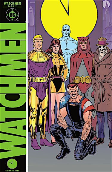
Cover Image:  As we will see in future issues, a common design element for each of the twelve chapters is that the cover image is always an extreme close-up of the first panel within the issue proper, essentially making the cover the first panel of each issue.  Here we see a close-up of what will be one of the major recurring symbols throughout Watchmen – that of the smiley faced button with its spot of blood above the right eye.


PAGE 1


Panel 1:  Introduction to Rorschach through his journal.  The initial statement: “Dog carcass in alley this morning, tire tread on burst stomach,” relates directly to a later issue in which we discover Rorschach’s origin and the incident that sent him over the edge to crazed vigilante.


We also see a storytelling technique that Moore & Gibbons use liberally throughout the book – though often for very different reasons.  That is, a bit of dialogue is juxtaposed against the image in order to, among other things, heighten readers’ awareness of events, comment upon two varying scenes, or offer a bit of irony to the audience.  In this case the statement: “I have seen its true face,” hangs just above the bloody smiley faced button in the gutter.


Panel 2:  Again, the juxtaposition of dialogue and imagery, as Rorschach writes: “The streets are extended gutters . . . full of blood” over a scene focused on a gutter that is full of blood.


Also, note the first clue to Rorschach’s identity as his feet walk out of the journal entry into the blood, foreshadowing the bloody path down which he and his fellow “heroes” are about to tread.


Panel 3:  First look at the man holding the “The End is Nigh” sign – whom I’ve seen dubbed the Doomsayer elsewhere but whose name we will discover is Walter Kovacs, alter-ego of Rorschach.


We also have more dialogue/imagery juxtaposition with Rorschach’s: “. . . I’ll look down and whisper ‘no.’ ”seen from a camera angle above the two men in the panel.


Panel 4:  And more juxtaposition as we read Rorschach’s journal entry:  “They could have followed in the footsteps of good men . . .” and see Kovacs’s bloody footprints lead away from the pool of blood.


Panel 5:  The camera angle continues to pull back higher and higher as Rorschach writes:  “. . . and didn’t realize that the trail led over a precipice . . .”


Also note our first clue as to who killed the Comedian.  The large truck in front of the bloodstained sidewalk sports a pyramid within a circle, the corporate logo for Adrian Veidt’s companies.


Panel 6:  The camera rises still higher as the pool of blood becomes nothing but a spot on the scenery below.  Rorschach writes:  “. . . the whole world stands on the brink, staring down into bloody hell . . .” which also foreshadows later events.


And the statement:  “. . . nobody can think of anything to say.” carries over into


Panel 7:  as an ironic comment on the detective’s flippant remark:  “That’s quite a drop.”


This panel, and the slow pan away from the gutter in panels one through six, also highlights a visual theme for this issue, that of great heights (whether that of these skyscrapers or, figuratively, those heights to which the heroes once attained) and staring down into the abyss.


PAGE 2


Panel 1:  Detective #2:  “Do you think you black out before you hit the sidewalk, or what?” 
This question will be answered in a later flashback.


Also, in the distant background we see one of the zeppelins that will pepper the skylines of the book, signifying this is a different Earth from ours, and also symbolically displaying the reality that Dr. Manhattan – whose symbol is a hydrogen atom, which would be the fuel for the zeppelins – is looming above everything in this brave new world.


Panel 3:  With this panel, we see something novel for comics in the mid-80s, though more commonly utilized today – the use of color to evoke an emotion or imprint a scene or scenes with a common hue.  The flashback scenes of Edward Blake’s murder are all bathed in red.


Panel 5:  “He would have put up some kind’a fight, I’m certain.”  We can see with the imagery – and again, we see the juxtaposition between words and images – just how hard a time the victim was having of it, despite his physical size.


Panel 7:  “Maybe he just got soft.” 
Again, this statement juxtaposes with the imagery, and we can see that, although he’s taking a pounding, Blake is someone who has not lived a soft life.  We also see that, contrary to the theory these detectives are positing, it appears it was only one person that took out Blake.  Of course, the point of view of the reader is such, that this is not conclusive. 


Panel 8:  “It’s Vice President Ford!” 
This is our first indication that the world in which the Watchmen live is not the same as the world in which we are living.  Ford was out of office – as the President – in 1976, but this story takes place in 1985.


PAGE 3


Panel 2:  Note the pirate ship on the bookshelf behind the detective.  Pirates are the most popular characters for comics in this world where superheroes walk among the populace, and the “Tales of the Black Freighter” comic that will be shown later will have far-reaching symbolic significance on the main story itself.


Panel 3:  Here we see the blood spattering the smiley face button.


Panel 6:  More hints at a different world:  fashion as exemplified by the hat worn by the man in the elevator, and the smoking implement utilized by this same man – especially as compared to the traditional cigarette Detective #2 is smoking.


Panel 7:  Another example of juxtaposition, this time used for black humor as the man in the elevator tells the detectives:  “Ground floor comin’ up.” as we see the image of Edward Blake being thrown through the window.


PAGE 4


Panel 1:  Knot-tops, KT-28s, and ‘Luudes are references to kid gangs that exist in this alternate reality.


Panel 2:  Juxtaposition:  “A lot of crazy things happen in a city this size.” overlaid on the image of Edward Blake falling to his death.


Panel 3:  An insinuation that heroes are not beloved on this Earth as they are in our comics when Detective #2 makes the comment:  “We don’t need any masked avengers getting interested and cutting in.” 


Note the comic in the boy’s hands in the foreground – the first look at the “Tales of the Black Freighter.”  Also note behind him two other comics – “Pirate” and “X-Ships,” and, more importantly, the headline on the newspaper states “Vietnam 51st State” an even more ominous indication that this is not our world.


Panel 4:  Juxtaposition:  “. . . well, what say we let this one drop out of sight?” as Edward Blake falls into the night.


Panel 5:  First mention of the Keene Act of 1977, which we find out later is the legislation that outlawed masked heroes. 
The cars look different, another sign this is a parallel reality. 
On the right of the panel we see Kovacs marching with his sign toward the detectives. 


In the foreground, a symbol of another of the overriding themes of the book – the threat and fear of nuclear devastation – can be seen in a flyer for a popular candy, MMeltdowns, which has as its brand image a mushroom cloud, symbolic of the meltdown from a nuclear detonation.


Panel 6:  The statement, “Rorschach’s still out there.” carries over to


Panel 7:  as, in the foreground, we see Kovacs (the alter-ego of Rorschach) approaching the detectives. 


Note Kovacs is checking his watch, which is on his right wrist, signifying that he is left-handed.  (Clue #2 that he’s Rorschach)


The statement, “What’s the matter?” from Detective #2 as Detective #1 pulls his jacket closer about his neck, carries over to


Panel 8:  as Detective #1 says, “Uh, nothing . . . just a shiver,” as they pass the man with the “End is Nigh” poster.  This is significant because the man they are discussing, Rorschach – a violent and feared vigilante – is the man with the “End is Nigh” poster.


PAGE 5


Panel 1:  Clue #3 that Kovacs is Rorschach: 
It is now night, but looking back at the final panel of Page 4, we see that this is the same image from a slightly different angle, and where we saw Kovacs’s head in Page 4, Panel 8, we now see the top of Rorschach’s hat.


Panels 6 & 7:  Rorschach takes out his grappling gun to fire it with his left hand, tracing back to panel 7 of the previous page, where we see that Kovacs is left-handed from how he wears his watch.


Panel 9:  Rorschach scaling the façade of this skyscraper is another indication of the overall theme in this issue of the heroes looming over everything in this world. 

Sunday, January 8, 2012

Reading Watchmen - and so it begins

With the advent of 2012, I have begun my year-long examination of Alan Moore's & Dave Gibbons's Watchmen over at my new sister site - Reading Watchmen.  I'll be repeating sections of my analysis here - mainly in the form of annotations, but with some essays as well - through the year to direct readers over to Reading Watchmen. 

Here is the opening to my annotations of Chapter 1, a short introduction to the project along with a thematic overview (one thematic overview) of the chapter in question.  I hope you enjoy, and click the link above to go check out the annotations for the first several pages of this landmark graphic novel.

thanks,
chris

CHAPTER I:
At Midnight, All the Agents . . .

First, a caveat:

In his introduction for the re-issue of Alfred Bester’s The Stars My Destination, Neil Gaiman wrote, “. . . you can no more read the same book again than you can step into the same river.” Which is true. When I first read The Lord of the Rings as a teenager it had a very different meaning than when I read it in my early thirties. I had matured, my understanding of the world had grown, and I had broadened my experiences during the interim fifteen or so years. It was a far different book than the one I remembered, because my perspective had evolved.

Which is to say, there are many themes one can pluck from Watchmen and its individual chapters. It all depends upon your point of view. As an introduction to each chapter, I have chosen to discuss a specific theme or visual motif found within that chapter, as a way to look at the chapter in toto and to get you, the reader, into a proper mindset for what follows. I chose to focus on a single theme with each chapter in order to keep you, and me, from getting bogged down under the weight of my own words, and to make each of these chapters a bit less cumbersome. I would also encourage you to dig a little deeper into your own reading of this book and see what other theme and motifs you discover. I hope you enjoy.

A note on Spoilers:

 I am going to assume that if you’re reading this, you have already read Alan Moore & Dave Gibbons’s Watchmen. With that in mind, please note that spoilers abound in what follows. In fact, arguably the two biggest mysteries in Watchmen (the identity of Edward Blake’s killer and the identity of Rorschach) are given away in the annotations for panels 5 & 3, respectively, of page 1. So, please be forewarned: these annotations are meant to enhance one’s reading experience of Watchmen and it would be doing yourself a disservice to continue from here without having read the source material first.

Thematic Overview:

As Watchmen opens, it has been eight years since passage of the Keene Act, a law that outlawed masked vigilantes. In the 1985 of this story only three heroes are still active – Dr. Manhattan and the Comedian both work for the U.S. government while Rorschach continues his fight against injustice in his own inimitable manner. Despite this, these heroes – even those who have retired – loom large over this world’s landscape. They drive public policy and scientific advancements from the shadows, shaping this world in ways that could not be imagined by the “common man.”

Throughout this first issue, Dave Gibbons accentuates the sense of these heroes towering above the landscape, and the people, through his visuals. In fact, we experience this in the opening scene. As the camera pulls up and away from the blood-splattered smiley face button, we ultimately reach the scene of the crime. At an almost vertiginous height, we meet the detectives in charge of the case as they peer out from the window of Eddie Blake’s apartment – the pool of blood on the sidewalk now little more than a spot of red.

Lofty heights are also utilized when introducing most of the other main characters – Rorschach, Adrian Veidt (Ozymandias), Dr. Manhattan and Laurie Juspeczyk (Silk Spectre II). We first see Rorschach as he approaches Blake’s apartment building (our vantage point is from beneath Rorschach, giving us a sense of the skyline above him), and watch him scale the side of the building to enter Blake’s apartment. Veidt is introduced in the penthouse of his corporate tower, a skyscraper that appears to overlook the entirety of New York City. Dr. Manhattan, who can modify his body in any manner, is introduced to us – along with Laurie – as a giant at least as tall as seven full-grown men. We, the readers, are meant to feel insignificant in relation to these characters through their depictions in these introductory scenes. It is worth noting that the only member of the Watchmen not introduced in this manner is Dan Dreiberg, the second Nite Owl, who is also the most grounded of these heroes.

The use of this visual motif throughout the initial chapter is interesting and says a lot about the characters as well as the setting of this book. By dint of the book’s title alone, we know the Watchmen are the main protagonists, despite the fact that most of them are no longer active agents. But still, they hang over this world like a dark cloud, affecting the status quo – particularly Dr. Manhattan – so dramatically that the average person might feel obsolete. The general populace is scared of these vigilantes, which is why the government disbanded the Watchmen and outlawed masked vigilantes.

This use of vertiginous imagery also helps us understand the psychological make-up of the heroes as well. Blake and Veidt are characters who are motivated by the moral superiority the feel the hold over everyone else. Veidt’s unmatched intelligence and physical prowess, in his mind, feeds his belief that he should be the final arbiter of mankind’s path. While the Comedian (Blake) always harbored disdain for the rest of the heroes, who, in his mind, didn’t understand the big picture. He laughed at their attempts to curb crime by attacking the symptoms – drug pushers, prostitutes, petty criminals, supervillains” – when he knew that nothing would change unless they were willing to attack the source – those corrupt individuals with political or economic power. And Dr. Manhattan’s detachment from the rest of humanity is visualized brilliantly in his opening scene – his nearly fifty-foot-tall blue frame not only exhibits his unbelievable powers, but also punctuates his emotional distance from what it means to be a human being.


There are many other instances of this visual motif throughout the issue and the rest of the series. It is one of the things that comics can do so well, offering subtle visual cues that can enhance the mood or themes of a story. This was one of the stated aims of Moore & Gibbons with Watchmen – to expand what was possible within the medium and to focus on the unique aspects of storytelling in comics without losing the basic premise, tell a good story. It is this ambition, coupled with their respective talent, that spurs me to return to Watchmen year after year, only to discover something new with each reading that I hadn’t experienced before.

Saturday, December 31, 2011

Friday, December 30, 2011

T-minus 2 days


Only two days until my year-long examination of Watchmen starts at ReadingWatchmen.com.  Come join what I hope will be an informative and interesting ride.

chris

Thursday, November 10, 2011

Reading Watchmen - coming 01/01/2012

Starting January, 2012 - a second blog dedicated to discussing, analyzing, and reading Alan Moore's & David Gibbons's masterpiece, Watchmen.

www.ReadingWatchmen.com

Saga of the Swamp Thing #23 -- general thoughts

  A brief (re)introduction. Two friends of mine, Brad & Lisa Gullickson, hosts of the Comic Book Couples Counseling podcast, are doing a...