Thursday, October 27, 2011

OCTOBER COMICS Coraline, adapted by P. Craig Russell

I am a huge fan of Neil Gaiman and have read all of his published books. Coraline was an enjoyable read, but I would probably put it toward the lower end of my favorites by Gaiman. It was inventive and well-written, as I have come to expect from Gaiman, and he took me to another fantastic world that feels just beyond my reach, but there was a “weight” missing from it that probably has a lot to do with its intended audience. Ultimately, for me, Coraline wasn’t creepy enough.

As an aside, Gaiman’s “Graveyard Book” does carry that weight I so look forward to from his best fiction, and that was also intended for young adults, for what it is worth. (And it is only my opinion)

When I heard P. Craig Russell was going to be adapting Coraline into graphic form, I was intrigued but not overly excited. Boy, was I wrong to have that reaction!

Russell’s adaptation of Coraline was amazing. When I read it, I was thoroughly on edge. Something about actually seeing Coraline’s “other family” with those button eyes just creeped me the hell out more than Gaiman’s actual prose description, which is odd since Joe Hill’s similar description of the main ghost in his novel Heart-Shaped Box made me horribly uncomfortable when I read that.

Russell is known for his delicate linework, and he does not disappoint here. But I have to admit at how surprised I was with the manner in which he evoked the atmosphere of this eerie little novel. It is a testament to his artistry that he elevates Gaiman’s prose narrative to another level for me. This is one of the very few times I have thought that an adaptation of a work of prose was better – or worked better – than the source material.

I wish I could more precisely put my finger on what it is about Russell’s Coraline adaptation that makes it so much creepier for me. But, I admit, I can’t. I just know how I reacted to it when I read it – on an entirely emotional level that left me with that gnawing ache in the pit of my stomach. Check it out.

chris

Wednesday, October 26, 2011

OCTOBER COMICS The Broadcast by Eric Hobbs & Noel Tuazon

Since “discovering” Noel Tuazon’s work on Elk’s Run, with writer Joshua Hale Fialkov, I have become a huge fan of Tuazon’s work. His loose lines and cartoonist’s approach to drawing is far more appealing to me than the current flavor of the month at the “Big Two.” He, like many of the comic artists whose work I admire, is able to infuse his pages with more emotion and atmosphere than most artists working in the field.

Link

So, when I passed the NBM table at last year’s Small Press Expo and saw they had only one copy left of Tuazon’s most recent book, The Broadcast (written by Eric Hobbs), I had to pick it up. And was I ever glad I did. This book, along with Tuazon’s return collaboration with Fialkov, Tumor, has solidly put him on my “guaranteed winner” list.

The Broadcast, Eric Hobbs’s first major graphic novel, comes from a brilliantly simple concept – how might a small group of rural Americans in early 20th century America react if they believed Orson Welles’s “War of the Worlds” broadcast was real – a reality that earned Welles much criticism after that initial radio broadcast. I haven’t read The Broadcast since that first time last year, but the emotion of the book has lingered with me since then, rearing its head at unexpected times, so it is only appropriate that I write about it now, as best I can.

The Broadcast is more than just how people might react to a perceived Martian attack. It is really a story of how people under stress react to, and treat, one another and the hierarchy that quickly evolves in such an anxious time. This book is about these characters, about the injustices, perceived or otherwise, they manage to suppress until such a time as this, and the consequences of allowing one’s anxiety to dictate one’s actions.

None of the characters make it through this book in one piece, whether emotionally or physically, and Hobbs deftly handles the issues of that period – including most prominently the racism that was rampant, and is still a problem now, in our country. The Broadcast is, at times, a harrowing reading experience, but it is also touching in many instances. It’s a delicate balance of emotions that Hobbs and Tuazon manage to achieve wonderfully, and it elevates this book beyond what could easily have been a one-note story.

And the artwork from Tuazon is beautiful. His inkwash technique, coupled with Tuazon’s facility with facial expressions, perfectly evokes the atmosphere of the dreary, rain-soaked setting and the weight of finality under which these characters rest. Tuazon’s storytelling is on full display here, and any artist looking to break into comics would be hard pressed to do better than study The Broadcast, or any of Tuazon’s other work.

Although told in a quiet manner, this is a brutal book about the dark places of the human soul. It is a compelling read that shines a hard light onto the horrors of fear, very real horrors that feel more authentic than most of those found in graphic fiction, or fiction of any kind. Hobbs and Tuazon come together to showcase the best of what this medium has to offer, and I heartily recommend you seeking this book out. You won’t be disappointed.

chris

Tuesday, October 25, 2011

OCTOBER COMICS: Batman – Legends of the Dark Knight Halloween specials


I’m not sure why I picked up the very first LOTDK Halloween special. I know it had nothing to do with the creative team – neither Jeph Loeb nor Tim Sale was familiar to me at the time. It could have been the nice shiny cover, with that gold foil “enhancement,” but I like to think that wasn’t the case. More likely, it had to do with the fact that it was prestige format. When a publisher – most often DC comics – published a book in that squarebound format (see: Dark Knight, Longbow Hunters, Hawkworld, Killing Joke, etc.), it piqued my interest. So I bought that first special right off the shelf. And I loved it. The story moved along at a brisk pace, the artwork was stylish but appealing, and it was done in one.


With the success of that first Halloween special, it became an annual tradition for the next two years, with Loeb and Sale reuniting to tell other ethereal tales from Batman’s history. They too were immensely enjoyable and just plain fun reads. And, with each successive volume, I came to appreciate more and more the artistic talent of Tim Sale.

Sale’s linework is smooth and organic, with fluid inking that helps to suggest movement on the page in a similar manner to the inking style of Will Eisner. It’s a tough thing to accomplish in a static medium such as comics, and is a major reason why I have such trouble with many of today’s photorealistic artists – their work is just too precise, taking all of the energy out of their drawing.


Loeb’s writing has received a lot of criticism in recent years – not all of it undeserved – but in these specials, he really shines. The stories move along at a brisk pace and don’t collapse under the weight of a longer narrative. With the limited page count, Loeb was forced to pare things down and get right to the heart of the matter, and, similar to Chuck Dixon, Loeb can drive a plot forward pretty well. It doesn’t hurt that he was paired with a stellar talent like Sale.

I regularly return to these books, pulling them out of the longboxes to re-read every couple of years, usually during this season. These books help remind me why I love comics. If you’ve never given them a try, you should seek them out. You won’t be disappointed.


And, if you have the chance, read them late in the evening while the wind sweeps across your lawn – the creaking branches and rustling leaves will add to the atmosphere already present in Sale’s moody linework, and you might understand better why I cherish these stories.

chris

Friday, October 21, 2011

OCTOBER COMICS: Taboo from Spiderbaby Grafix

It is appropriate that October be the month of Halloween, especially here in New England with darkness creeping in at the frayed edges of these shorter days, the naked branches scratching against window panes as brittle leaves blow past, propelled by a chill wind heralding the coming winter. The brisk air is tinged with a scent of horror – something almost tangible – that insinuates itself into our minds as we try to reconcile the change in the seasons.

Stephen Bissette’s horror anthology, Taboo (published from 1988-1995), masterfully captures the atmosphere of this time of year. With contributions from such notable writers and artists as Dave Sim, Charles Burns, Tom Sniegoski, Charles Vess, Bernie Mireault, Keith Giffen, Chester Brown, Eddie Campbell, Moebius, Melinda Gebbie, Neil Gaiman, Michael Zulli, Alan Moore, and Bissette himself, every issue of this series reaches for – and often achieves – an incredibly high standard of graphic storytelling.

From Hell and Lost Girls both had their starts in this anthology. Readers also experienced the fleeting glimpse of Gaiman & Zulli’s Sweeney Todd (with the prologue found in issue 7), which never found another publisher once Taboo ceased publication. Spain Rodriguez’s succinct retelling of Alejandro Jodorowsky’s cult film classic El Topo can be found within the pages of this book. (issue 4, to be exact). And there is any other number of horror masterpieces to be found within various issues of this landmark series.

The offerings in Taboo are not what one would describe as typical horror comics. These stories are disturbing, uncomfortable, demanding pieces of art. They are the horrors that keep one up at night, staring into the blackness to identify the sound that startled you awake. These stories are creepy, and the slimy film of the narratives is hard to wash off, staying with you long after the book is closed.

If you’re a fan of “shock” horror and want to be scared – Taboo might not be the book for you. But if you like your fiction challenging, if you want to read stories that make you think, and if you appreciate that anxious flutter in the pit of your stomach when the clock strikes midnight, then you should be seeking these books out because they are becoming harder and harder to find.

The stories found in this seminal anthology are a fitting capstone to a crisp, cool October day.

chris

Thursday, October 20, 2011

OCTOBER COMICS: Hellboy

This time of year I always dig into my longboxes or go to my shelf for something appropriate to the season. Recently, I’ve been re-reading some of the early Hellboy collections by Mike MignolaWake the Devil and Chained Coffin & Others, to be precise.

It’s been a while since I’ve read any Hellboy, and I had forgotten how great this series is. Mignola really seems to be having fun with these stories. He packs so much action, fantasy, folklore, and fun into these tales that it really is a wonder to behold. Even through pages of talking heads and exposition, Mignola makes it interesting – whether it’s the cadence of a character’s speech or just the fanciful nature of the dialogue – and I find it completely engaging.

Even with the emphasis on plot and the fantastical elements of these narratives, Mignola doesn’t forget about the characters. He knows Hellboy and Abe and Liz and all the others, and he plays them off each other well. It would be easy for the story to trump the characterization, but Mignola manages to balance things and has me wondering where he went with all of these great characters.

And has an artist ever been more suited for the stories being told? The way Mignola paints his blacks (with apologies to the Rolling Stones) and the manner in which he delineates the ancient architecture all adds to the atmosphere of these tales. The imagery has a gothic feel to it that is perfectly suited to the narratives, along with being pitch-perfect for this world Mignola has created.

If you want something haunting and exciting for this autumnal season, you would have trouble doing any better than Mike Mignola’s Hellboy. After re-reading these older books, I am now going to seek out the later volumes to see where he has taken “the big red guy” and the rest of the BPRD, and I cannot wait.

chris

Tuesday, October 18, 2011

OCTOBER COMICS: A Glimpse of Crime & Terror

It’s October, which means I have an obligation (self-made though it may be) to recommend some cool “autumnal” comic fare (i.e. horror comics in honor of Halloween)

Anything Scott Morse is involved with gets my attention. He is one of those cartoonists – like Los Bros Hernandez or Frank Santoro – whose work I will buy without hesitation. Since he landed at Pixar, his comics work has been rather limited. So, when I read online about him and Steve Niles doing something together, I was interested.

The series – co-created and co-owned by Niles and Morse – is called Crime & Terror. Morse described the book on his blog as a book where he and Steve can create the stories they want. In his initial post, Morse wrote that Crime & Terror would have an over-arching narrative following detective Mike Fallon, along with a number of short stories – both prose and comic – in whatever genre they chose – sci-fi, horror, noir, whatever. I’m a sucker for great anthologies, and when you have creators of this caliber writing and drawing whatever they want – I’m in!

As a teaser, Niles and Morse have created a limited edition oversized board book of A Glimpse of Crime & Terror that includes two short stories. I read this a couple of weeks back and thoroughly enjoyed it. Morse’s artwork and storytelling are spot-on here, and the stories were novel for the fact that they weren’t what I was expecting.

I expected a crime story and a horror story, but instead, Morse and Niles offer a mash-up of these two genres, and it works amazingly well. The plots hearken back to noir films of the 50s – with the requisite sprinkling of the fantastic and zombified accents. They aren’t necessarily world-shattering. But the beauty of this book is in the way the stories are told. Despite the “dark” nature of these two genres, there’s a fun aspect to this book that is never missing in anything Scott Morse does. I imagine it has a lot to do with the animation style Morse incorporates. His work is distinct, and, despite the “cute” aspects of his art, Morse continues to exhibit a range in genre and tone that is remarkable.

And, if you order this limited preview, each copy will be signed by Morse. So get on it.

The regular book will be a series of 80-page hardcovers, and I cannot wait for the first one to drop. Be on the lookout, because these are going to be some fun, entertaining, and well done comics.

-chris

Sunday, October 16, 2011

NEW COMICS: Love & Rockets (New Stories) #4


I came late to the party where Love & Rockets is concerned. But, thanks to my wonderful wife, I got introduced to the amazing cartooning of Los Bros Hernandez the right way when she bought me the omnibus editions of Palomar and then Locas a few years back. From page one of Beto's Palomar stories (which came out a year before Jaime's Locas collection), I was hooked.


At that point, Fantagraphics was producing volume II of L&R, in a smaller comic-sized format. I got all 20 of those issues and have continued on with volume III, which offers new stories from these master cartoonists in annual 100-page chunks, with Jaime and Gilbert each taking roughly half of each book.


If you have never read Love & Rockets, and you are a fan of great comics or just great storytelling, you need to remedy that situation. There are few cartoonists working today of this caliber. Their stories are poignant or fanciful or cute or heartbreaking or involve any number of emotions along one's mental spectrum. And their simple, yet elegant art (with Beto having a softer, more rounded look to Jaime's very precise, sharper lines) illuminate these stories so perfectly.


The Hernandez Brothers (including, from time to time, Mario) are also pioneers in graphic storytelling, utilizing the page and its inherent rhythms and boundaries to evoke these emotions and tell their stories in new and inventive ways, despite having done this for nearly three decades. It is a testament to their mastery of the medium that, with this latest iteration of Love & Rockets, one still finds something new within their work to be amazed at.

For example, take a look at this double-page spread encapsulating the relationship between Maggie and Ray through the years. Simply brilliant:


And, if you want, here are those two pages at a larger size, for a better comparison:


In particular, the work of Jaime in these last two installments of the "New Love & Rockets" has been breathtaking. In issue #3, he ripped my heart out with the understated narrative he offered, illuminating facets of the Chascarrillo family (Maggie's family of Hopey & Maggie) that put many of his previous stories into a whole new light. It was an amazing, heartbreaking story full of very authentic emotions, but handled so deftly that it resonated more.


And Jaime followed that up with equally heartfelt and emotional chapters of Maggie's story in this latest issue. The way he continues to tell these characters' stories - while also allowing them to actually grow old and evolve into similar, yet new, characters - and add more to what has come before without it growing stale is a joy to experience.


Gilbert's offerings in this volume are equally enjoyable, if less "earth-shattering." In recent years, Beto has been enjoying recounting the B-movies of his character Rosalba "Fritz" Martinez. They are fun, over-the-top, stories that allow Beto to show a fanciful side, which has always been present in his work. But I don't want to downplay his contributions. The beauty of these stories has been the little bits of humanity lurking beneath the slick veneer of the main narrative. The moments when we see Fritz away from the movie set, able to be human and relate her own feelings and dreams. These are the gems that elevate his recent narratives.


The humanity and the artistry found between the covers of any Love & Rockets book is a wonder to behold. Every new edition jumps to the top of my to-read pile, even trumping the novels I may be reading at the time. And this newest iteration of Love & Rockets is a nice hefty package that affords Los Bros Hernandez to produce longer works that keep them invested in the material, which was part of the reason for the change in format. The subtle differences in art style, along with the different stories each brother wants to tell (and did I mention that Jaime was producing a superhero story with his characters in the initial two issues of the "New Love & Rockets"?) provides a nice balance within each issue.


You cannot go wrong with Los Bros Hernandez and Love & Rockets. Seek it out. Now. You won't regret it.

chris

Saturday, October 15, 2011

ESSEX COUNTY vol. 1 by Jeff Lemire

Wow! I read the first volume of Jeff Lemire’s Essex Country trilogy, “Tales from the Farm,” last night (the entire thing is available in one handy volume from Top Shelf) and was completely enthralled. Lemire’s deft storytelling belies his relative inexperience at the time he wrote and drew this. Seriously amazing work.


The story takes place in Essex County in southwestern Ontario, where Lemire himself grew up. In this first chapter of the trilogy, readers meet Lester, a young boy who enjoys comic books and dresses up in his own makeshift costume to battle invading aliens in the back fields of the farm where he lives. Though not immediately evident, it is his Uncle Ken with whom Lester lives on the farm, and their relationship is strained at best.


Lemire, thankfully, does not spoon-feed his audience, allowing the narrative to reveal itself at a measured pace while keeping readers engaged in the story. Soon enough, one discovers that Lester recently lost his mother to cancer and does not remember his father. This, as much as anything, explains the divide between the boy and his uncle. It’s heartbreaking and authentic, and Lemire’s choice of imagery and spare dialogue convey this emotional chasm masterfully.


Through the course of this first chapter, readers follow this new family of two through a year on the farm, slowly learning more of their history. Lester befriends a local celebrity – Jimmy Lebeuf, who played a single game in the NHL for the Toronto Maple Leafs, wherein he suffered a career-ending injury – and finds the companionship he needs, at this time in his young life. Lester is comfortable with Jimmy, who enjoys discussing comic books with the boy and even dresses up in his old hockey uniform to help Lester battle his alien invaders. It’s a touching friendship, one made more sympathetic when Lester’s uncle warns Jimmy off, hinting at something more than just familial responsibility.


Lemire paces this first volume of his Essex County trilogy so beautifully, teasing out information, allowing readers to make the connections between these characters. His deft use of silent and repeating panels – all utilized to provide narrative beats or accentuate an emotional tenor within the story – help create an engaging graphic novel that had me enthralled from page one. And, when this volume reaches its climax, it is presented in such an understated manner that it will resonate with readers long after the book is closed.


Lemire’s raw, almost scratchy, brushwork adds an emotional layer that elevates this story. His work exemplifies the difference – and, in my opinion, the superiority – of cartooning over photo-realism, the current trend in “mainstream” comics. Lemire’s stark, expressive inks pull readers into this story, enveloping them in the raw emotions he is sharing through these characters. It’s a wonderful melding of art with words, showcasing what is possible in comics.


I understand, fully, why Essex County has received such widespread accolades, and I eagerly look forward to the next volume sitting on my to-read stack. If you haven’t read this book before, you need to seek it out. Now.


chris

Friday, October 14, 2011

Cully Hamner's Blue Beetle

So,

I had a big post ready for today - just needed a little polish and some images. But, my day has been spent with the little man (Ian, my 4-year-old), so no writing got done. We ran some errands, played with my old Ewok village, and hit the kids' museum. And now, he's sitting looking through the Blue Beetle collection I wrote about yesterday. So, in honor of that, here are some interior pages from those first issues of the Jaime Reyes Beetle by Cully Hamner.


Thursday, October 13, 2011

PLAYING CATCH UP: BLUE BEETLE SHELLSHOCKED


I was introduced to Cully Hamner’s artwork with his professional debut on Green Lantern: Mosaic, longer ago than Hamner might like to admit (I kid). I remember finding his art to be raw and energetic but not as refined as I might have liked. Forgive me, I was young. But it stood out because it was different, and Hamner’s name was registered in the back of my mind.

Over the years, I’ve appreciated watching Hamner grow as an artist. His uncluttered linework exhibits a mastery of how to effectively tell a comic story. I loved his work with Greg Rucka on the Renee Montoya Question back-up feature they did in Detective Comics. So, when I noticed the Blue Beetle: Shellshocked collection in the UMaine library where I work, I took it out to see what this “new” Blue Beetle was like, before he became new again with the recent DC relaunch.

This book was great, and so much fun! I loved learning about Jaime Reyes and this new iteration of the Beetle. I enjoyed seeing him do his research into the legacy of the character, working to discover exactly what he might be in for. I appreciated the fact that this hero was Latino, and that the creators (Keith Giffen, John Rogers, Hamner, et al.) portrayed this reality without hammering away at the clichés that can quickly descend such a scenario into farce. It felt genuine, and I applaud the creators and DC Comics for trying to broaden the spectrum of heroes within “mainstream” comics with this character.

One of the best things about this opening collection is the fact that Jaime, along with readers, is learning about his new powers as the story progresses. He isn’t adept at fighting – clumsily attacking some “men in black” at the Mexican border – and he knows very little about the armor that covers him when he manifests his Beetle powers. This adds authenticity to Jaime’s story, and makes readers sympathetic to his cause, while also providing interesting story possibilities.

Jaime’s interaction with his family, as well as that of his friends, provides a nice counter-balance to his new heroic persona. A good student, who is also a good person, Jaime feels different from other characters. It’s not just because of his ethnic background. Jaime is a real teenager, without the burden of personal tragedy that seems to be grafted onto most contemporary heroes. There is also a big question in his recent history that, I assume, had ramifications down the line in this series, but it is only hinted at in this first volume, and I’d rather not spoil it for anyone who might want to go back and check this out, as I did. It really adds a new dimension to Jaime’s character very early in his story.

And the art in this book – provided by Hamner, Cynthia Martin, Duncan Rouleau, Kevin West, Phil Moy, and Jack Purcell – is really lovely. Clean lines, dynamic cartooning, and work inspired by manga all add up to an energetic and fun read. If you like expressive artwork that tells a story well, this is a book for you.

My hope is that the new iteration of Blue Beetle in the DCnU retains the fun aspect this first volume exhibits. But for now, I would highly recommend checking this, and any subsequent volumes, out. I know I will.

chris

Wednesday, October 12, 2011

FRACTURE OF THE UNIVERSAL BOY by Michael Zulli


I first heard about this book two years ago and have been anxiously awaiting its publication ever since. With such anticipation, it is easy to elevate the work to a level where expectations cannot possibly be fulfilled, no matter the artist.

Thankfully, Michael Zulli is no ordinary artist. Fracture of the Universal Boy is a beautiful, heart-rending, emotional, personal, and moving piece of work. It is obvious how much time Mr. Zulli has put into this book, and it is a book that will reward future readings.

I devoured my advanced copy (thank you Kickstarter campaign) a few weeks ago in a single sitting – the book is roughly 200 pages long – and was very happy to find my “official” copy on the doorstep just the other day. The amount of detail on these pages is well-served by the oversized dimensions of the book, and the complete package is truly a thing of beauty.

I am letting the story simmer in the back of my mind for now. But, at some point soon, I plan on re-reading the book and writing a longer piece on this book. I only hope that I am able to do the work justice.

But I will say that, if you see this book at your local comic shop or book store, pick it up. You will not be disappointed. Mr. Zulli worked ten years on this book, and the care and artistry evident within its pages exhibits that commitment. It is an amazing book that is deserving of your support.

chris

Friday, October 7, 2011

More Infantino/Janson Flash wonderment

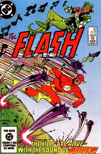
I mentioned in an earlier post that the combination of Carmine Infantino and Klaus Janson doing covers for the Barry Allen Flash series epitomizes my Flash. And this is the cover that cemented that for me.


Just amazing

chris

Tuesday, October 4, 2011

NEW TO ME: JLA Rock of Ages


JLA: Rock of Ages (collecting issues 10-15 of JLA) by Grant Morrison, Howard Porter, et al.


JLA: Rock of Ages feels like a true Grant Morrison comic – the first time in his tenure on the book that he appears to have let loose with his narrative creativity (though his wild ideas have been evident from a very early stage). “Rock of Ages” is a time-hopping story in which members of the League fall into a dystopian future that “could occur” if they don’t return and stop their colleagues from defeating Lex Luthor and his Injustice League, who are attempting a corporate takeover of the Justice League. The narrative wraps in on itself, twisting and turning until it’s difficult to discern which way is up, with the Worlogog (or Philosophers’ Stone) at the heart of the narrative – its design a visual metaphor for the mind-warping narrative Morrison creates with these six issues.

It is also fitting that, although a retread of the theme utilized in the two-issue story involving the Key, the heroes who fall into the future – Green Lantern, Aquaman, and Flash – must make their way back to stop their friends from defeating Luthor so that the dystopian future in which Darkseid has created a new Apokolips on Earth does not come to pass. This inversion of the typical superhero story mirrors the narrative framework Morrison uses for “Rock of Ages.”

Not to belabor the point, but the story does suffer – again – from the cluttered and sometimes confusing artwork of Howard Porter and John Dell. It really is a travesty, in my opinion, that Morrison’s inventive stories are hampered by such muddled, hackneyed art. There are panels and pages where it is difficult to tell what is going on, but thankfully, the words and the ideas peppered throughout the narrative kept me involved and enthusiastic.


And, once again, Morrison shines with the inventiveness of his ideas, which he always injects into the narrative in an understated fashion, adding to the wonder I take away from it. They are found in bits of dialogue or off-handed scenes that always come across as obvious once stated, but are ideas that feel brand new. These moments, more than anything else for me, are the moments that elevate this book and make it so enjoyable. Some of those moments of brilliance are:

  • J’onn J’onnz shrinking “the rational, analytical left hemisphere of [his] brain and enlarg[ing] the irrational right hemisphere” in order to “see the world as the joker sees it…” when he and Superman are stuck in a holographic maze created by the Joker’s consciousness.
  • Batman realizing Luthor is attempting a hostile takeover of the JLA and noting that Lex doesn’t understand he’s going up against someone with as much experience in the boardroom as he who plays the game of “corporate takeovers” better than Luthor – Bruce Wayne.
  • The Atom realizing (because Ray Palmer is a scientist) that, if Darkseid can see through his forceshield, that means light is getting through, and then shrinking himself down small enough to follow the light inside. Simple, elegant, and it makes one think.
  • Orion, in this alternate future, affirming his heritage as a warrior born of Darkseid and destroying the universe with the Genesis box in order to save it – thus, exhibiting the heritage of his upbringing by Highfather. Only Orion, a product of these two diametrically opposed fathers, could achieve such a feat.
  • Luthor using Jemm, Son of Saturn to try and block the telepathic abilities of J’onn J’onnz. (Man, I loved the lush artwork of Gene Colan on that series)

And of course, there are many more hidden gems within this volume of JLA. Very few writers are able to achieve this level of intelligence in “mainstream” comics, particularly within the superhero medium. I look forward to what Morrison does next.

chris

Saturday, October 1, 2011

THIS is my Flash!

I don't think they ever did any interior pages together - which is a shame - but when Klaus Janson came aboard to ink Carmine Infantino's Flash covers with issue 335 of the original Barry Allen series, those images just spoke to me.


Something about the delicate lines of Janson's inks (it looks like he must have used a small pen nib, though I don't know for certain) over Infantino's smooth pencils just made the Flash pop on these covers. Flash was "my" superhero and the blending of these two fantastic artists made an indelible mark on me as a kid.

chris

STAR WARS -- a modern trailer

 This came across my feed, and it's pretty stellar, even if it utilizes some special edition cuts.