Showing posts with label This Is My.... Show all posts

Thursday, June 23, 2016

THIS is my Superman --- [art edition]


Years back, Peter Rios (if my memory’s to be believed) started a thread, at the old CGS forums, asking people to share the comic artist who best epitomized any given character, for them.  Neal Adams might be your Batman artist (or possibly Berni Wrightson), Kirby (or John Byrne) your FF artist, Jerry Ordway (or Curt Swan) your Superman artist, Marie Severin (or Herb Trimpe) your Hulk artist.  It was a great thread that really got to the heart of why we, as comic fans, love and collect these stories—sometimes to an obsessive fault.  The conjunction of personal taste in art and affection for a particular character engenders a very specific attachment for us readers, which can lead to interesting and illuminating conversations.  (So, please feel free to share your own in the comments and kickstart this dialogue)


I have long held that Superman need not be overly muscled, in his depictions in comics and film, and would argue that it is more “realistic” for him to be lean and agile rather than a Mr. Universe type.  Superman’s power comes not from a hypertrophied physique but from the energy imbued within his cells by Earth’s yellow sun.  Not that he wouldn’t be muscular, but it isn’t necessary for the character as conceived, and it is more interesting, visually, if Superman circumvents the typical body type of male superheroes in comics. 


Certainly, there have been a number of artists to draw this icon of the four-color world, and they all brought their own personal style and sensibilities to the character, resulting in varied body types for the Man of Steel.  But the most iconic visualizations of Superman—by Curt Swan & Jose Luis Garcia-Lopez in the comics and Christopher Reeve in film—have tended toward this leaner body type.  Which may be why I prefer the leaner Superman as a template. 


That being said [written], “my” Superman would definitely have to be Jon Bogdanove’s version.  Feeling like an updating of Wayne Boring’s Superman, Bogdanove’s was BIG, with huge muscles.  And yet, it never felt as if he overwhelmed the panel or the scene, at least not in a bad way.  Bogdanove’s Superman was powerful, epitomized by Bog’s particular delineation of Kal-El, and it made for some dynamic imagery. 


During Bogdanove’s lengthy run on Superman: The Man of Steel, which coincided with Bog doing some of the product art for ancillary Superman merchandising—notable for the fact that Jose Luis Garcia-Lopez was pretty much the only artist providing DC Comics merchandising art for decades—he made his home in Maine, on Monhegan Island.  This afforded me a number of opportunities to meet Bogdanove, and his enthusiasm for the character was obvious.  (Bog named his son Kal-El)  And that enthusiasm was infused into the character and the comic, while Bogdanove drew it. 


Bogdanove’s Superman is a statue, cut from marble, come to [printed] life.  Bog’s Superman is solid, an irresistible force and an immovable object, all at once.  Ultimately, it’s his use of shadow and the thick lines for hatching—which help to define his Superman as a three-dimensional hero on a two-dimensional plane—that has always stood out for me (shout out to Dennis Janke, Bog’s longtime inker on Superman) and which still remains burned on my memory as the epitome of the Man of Steel.  

-chris

Tuesday, May 24, 2016

THIS is my Spider-Man --- [art edition]


Years back, Peter Rios (if my memory’s to be believed) started a thread, at the old CGS forums, asking people to share the comic artist who best epitomized any given character, for them.  Neal Adams might be your Batman artist (or possibly Berni Wrightson), Kirby (or John Byrne) your FF artist, Jerry Ordway (or Curt Swan) your Superman artist, Marie Severin (or Herb Trimpe) your Hulk artist.  It was a great thread that really got to the heart of why we, as comic fans, love and collect these stories—sometimes to an obsessive fault.  The conjunction of personal taste in art and affection for a particular character engenders a very specific attachment for us readers, which can lead to interesting and illuminating conversations.  (So, please feel free to share your own in the comments and kickstart this dialogue) 


Spider-Man is an iconic character, some might even say he’s the lynchpin of the Marvel Universe—or, at least, the standard-bearer for decades, leading up to the recent invasion of Hollywood by so many of Marvel’s spandex class.  Spidey was the one most visible in other media—with cartoons, a live-action television series, costumes and party favors and toys, and a musical—as well as, it could be argued, the one most accessible to nascent comic book fans.  And through the years, Spidey’s had a horde of great artists delineate his adventures—John Romita, Sr. & Jr., Todd McFarlane, Mark Bright, Gil Kane—but for me, it’ll always be Ditko! 


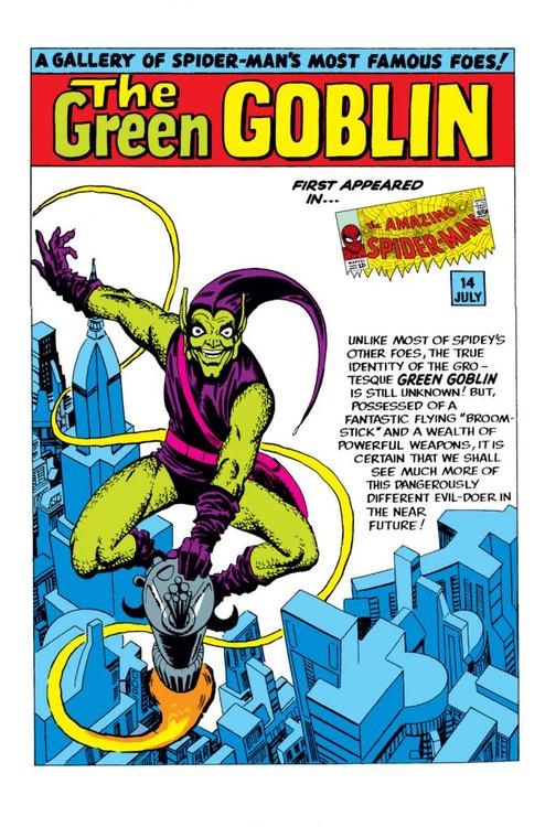
Ditko co-created Spider-Man, drew the book for the first few years, bringing to life such classic characters as J. Jonah Jameson, Betty Brant, the Vulture, Electro, Kraven the Hunter, and the Green Goblin.  He’s the artist who defined Spidey, for decades to come.  And he is, hands down, the best artist ever to draw the webslinger. 


Sure, it may seem a copout to go with the creator, but Ditko’s Spidey perfectly epitomizes the character, to my mind.  My introduction to Spidey was through Ditko—not the comics, but the original animated series from 1967.  Spider-Man, along with the other characters, were strongly modeled on Ditko’s style.  Images of him swinging through New York, coming directly at you through the television screen, are right out of those comics.  And, though incredibly amateurish, those cartoons were a ton of fun, at the age I discovered them. 


When I finally got an opportunity to read some of those early Spider-Man tales, my mind did not change.  Ditko’s work in those few dozen issues is stellar.  His fluid, easy line and facility with body language really elevate those comics.  All his characters look real, rather than the idealized HEROES™ we’ve come to expect from the “photo-realism” made popular, in recent years.  Peter Parker looks like a teenager.  Aunt May is an old woman.  J. Jonah Jameson is a loudmouthed buffoon.  Ditko’s work allows readers to better relate to these people, affording them an opportunity to become more invested in the stories and the drama, and become fans for life. 


Ditko is also able to infuse these characters with power and strength, when it suits the story.  Possibly the most famous sequence in all of Spidey’s publishing history can be found in issue #33, the final chapter of the 3-part “If This Be My Destiny” storyline.  Doc Ock has stolen a rare isotope that may be the only thing that can save Aunt May’s life.  Peter, as Spider-Man, is trapped beneath tons of heavy machinery.  Through force of will and thoughts of his family—his Uncle Ben, whom he let down, and his Aunt May, whom he must save—Peter is able to push himself off the floor and throw the pile of iron from his back.  It’s one of the most powerful scenes in Spider-Man history (or comic history, for that matter), achieved through the deft artistry of Ditko. 


Ditko is a master craftsman, still creating new comics today, and one of the giants in the history of the comic book medium.  And his work on Spider-Man illuminates that fact, greatly.  If you’ve never checked out these early stories, you definitely should.  And if you find the writing a bit grating, as I do, then just look at the pictures.  Because Ditko drew the best damn Spider-Man.  


-chris

STAR WARS -- a modern trailer

 This came across my feed, and it's pretty stellar, even if it utilizes some special edition cuts.